The brief
RETAL already had a strong promise, We Build for Generations. Its social presence didn't yet look like a brand that builds for generations.
Influence Group was pitching to become RETAL's social media and creative content partner. Our strategy team audited the brand and the Saudi developer landscape, then proposed a new brand idea: Progress, Made Livable. RETAL wouldn't just take part in Saudi Arabia's progress. It would turn that progress into places people live in every day.
My job was to turn that strategy into something you can see. That meant visual directions for RETAL's Instagram that feel premium and say something real about how people live.
Client & agency
RETAL Urban Development
Influence Group · 2026
My role
Senior Art Director. Concept, art direction and design of both directions.
Scope
Social media creative directions: carousels, key posts and video frames for Instagram.
Concept
I found two different emotional routes into the same brand idea, one about permanence and one about memory.
Art direction
I set the image tone, colour, composition and layout system for each direction so the posts work as one body of work.
Typography
I treated the Arabic tagline as the hero of each direction, explored typeface variations and set it as image rather than as a caption.
The idea
One promise, two directions
Direction · Calm & enduring
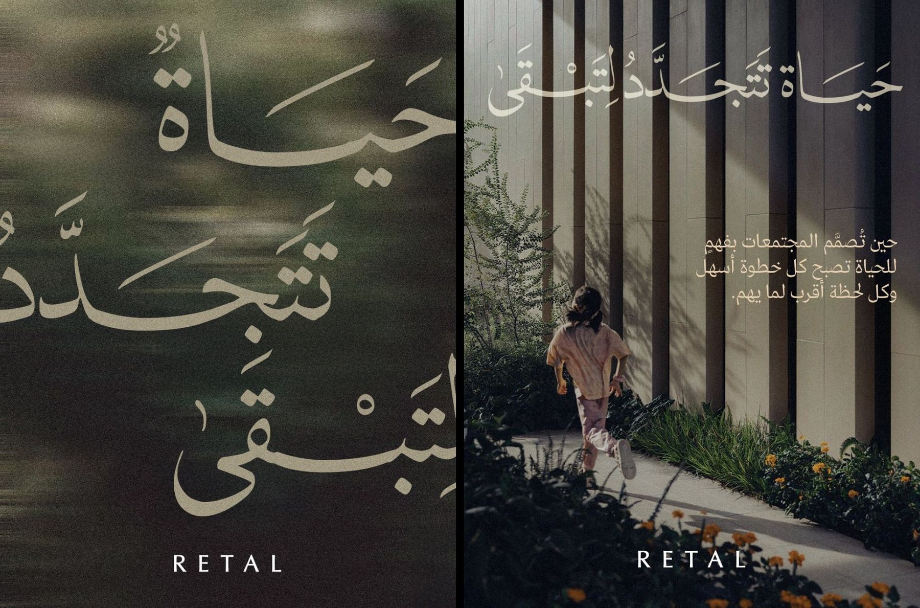
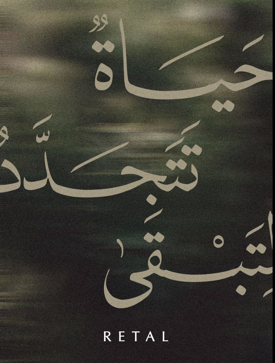
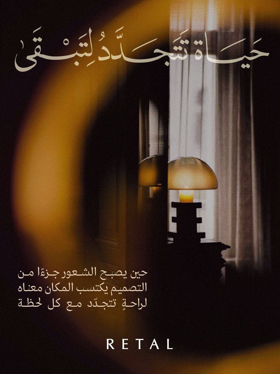
Life, Renewed to Last
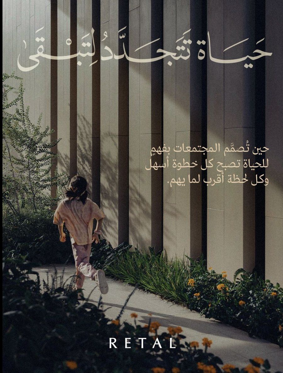
حياة تتجدّد لتبقى
“A life that renews itself, so it can last.”
This was the direction I pushed hardest. It speaks to the buyer who is investing in a home, and in what that home will mean in twenty years.
How I thought about it
If RETAL builds for generations, the visuals can't look like this season's trend. They had to feel like they would still hold up years from now.
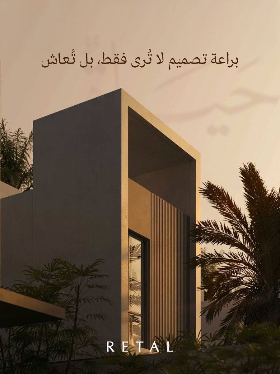
I kept the colours quiet: deep olive, stone, sand and a warm brass light. The layouts follow a strict logic, with lots of space and one idea per frame. That restraint does the positioning work. It tells you this is a high-end developer without any luxury clichés.
I wanted every slide to read as an artwork, something you'd hang on a wall, not an ad you scroll past.
Sustainability
Natural light, planting and raw materials appear in every frame. Nothing is glossy or rendered for show.
Adaptability
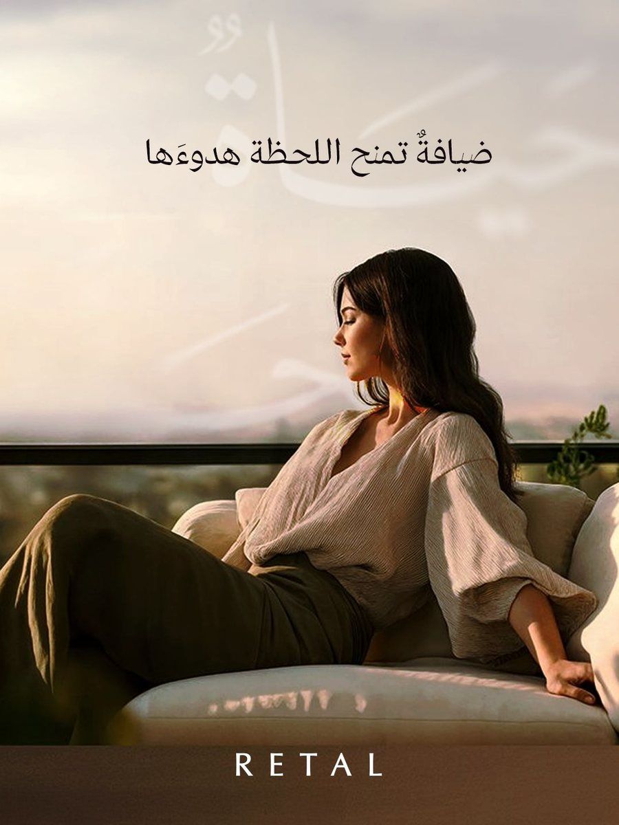
The same system covers architecture, interiors, people and hospitality without breaking.
Long-term value
Slow, calm compositions with soft focus and grain. Built to age well rather than to chase attention.
The craft
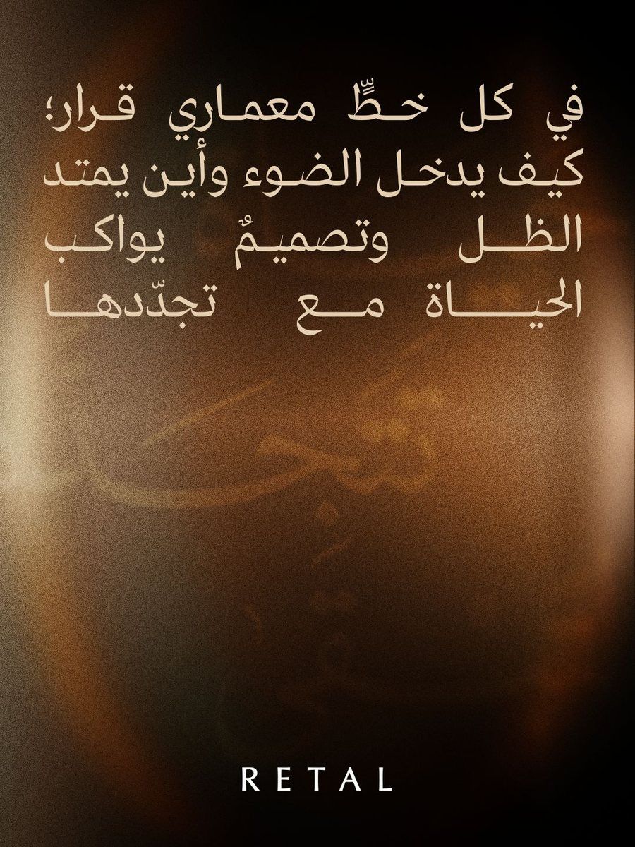
Palette: olive and stone for permanence, with sand and brass as the warmth of a lived-in home. Contrast stays low so the frames feel calm.
Type: a light, modern Arabic sans keeps the tagline elegant. It runs huge and faded as texture, then small and sharp as the message.
Image: soft focus, film grain and late, warm light, so every post looks like the same quiet hour of the day.
Direction · Hand-crafted memory
Growth, Pulsing with Life
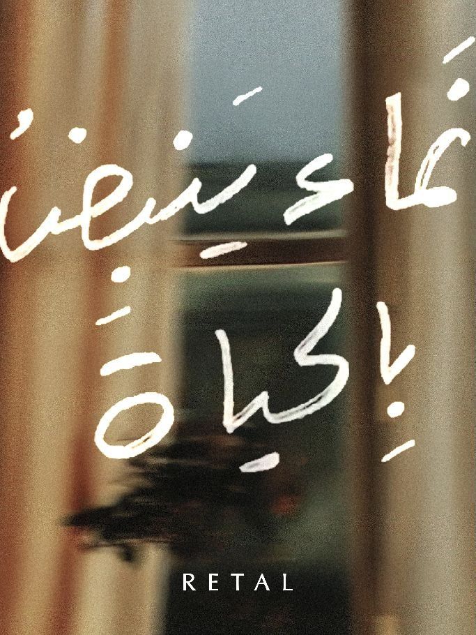
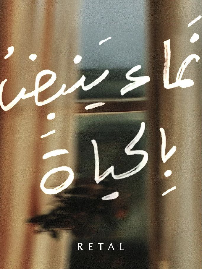
نماءٌ ينبضُ بالحياة
“Growth that pulses with life.”
The second route went the other way. It's personal instead of monumental, and made by hand instead of built.
How I thought about it
Homes are where we start our lives and where we write our stories. So I made every post a memory.
This direction is about things that are crafted by hand. The tagline is drawn like handwriting, not typeset. Postcards, stamps, clipped notes and letters sit inside the photography, as if someone kept them from a day that mattered.
The building is still there, but it becomes the backdrop to a family dinner, a coffee by the window, a note to someone you love.
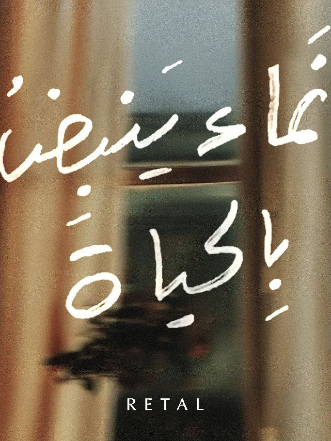
Handwritten type
The tagline and body lines are drawn, with uneven baselines and real ink texture.
Objects of memory
Stamps, clips and paper notes turn each post into a keepsake rather than an ad.
Lived-in places
People, food and light come first. The architecture holds the moment.
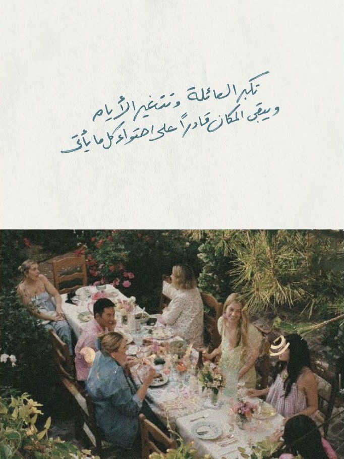
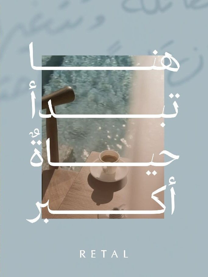
Palette & texture
Paper white, faded sky blue and ink tones: the colours of old photos and letters, warmed by terracotta handwriting.
Paper grain, deckled stamp edges, metal clips and soft film blur. Every surface feels like something you could touch, which is the point of a direction about memory.
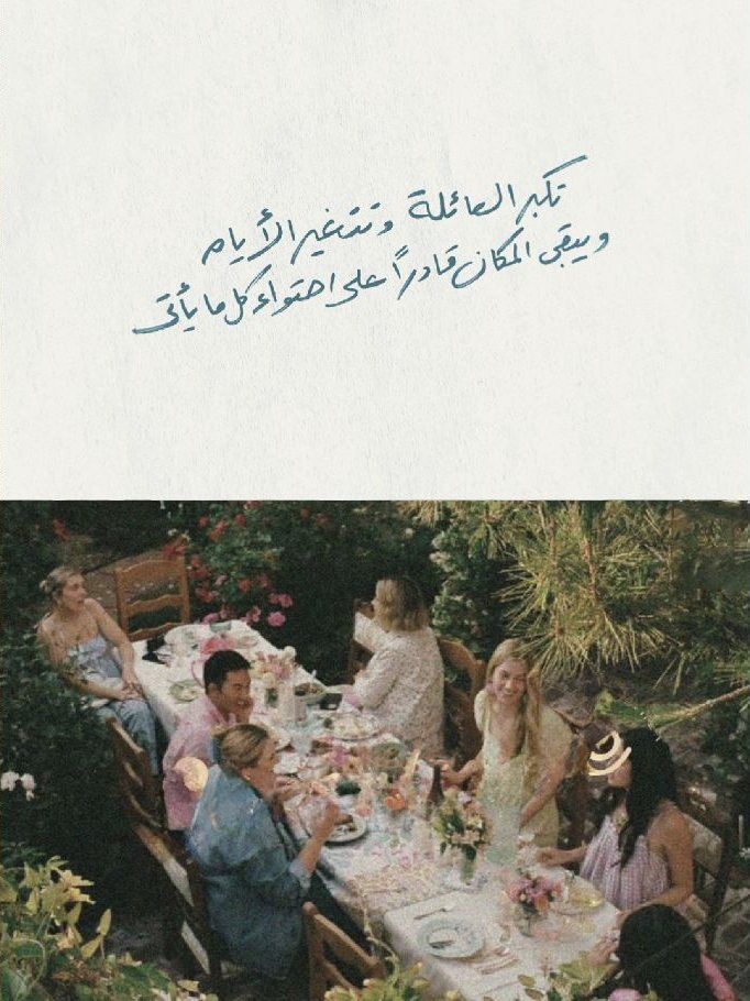
Finding the tagline's voice
Before landing on the hand-drawn version, I tested the tagline in a few typefaces, from clean typeset to fully handwritten. The hand-drawn one won because it carried the idea on its own. You know it's personal before you read a word.
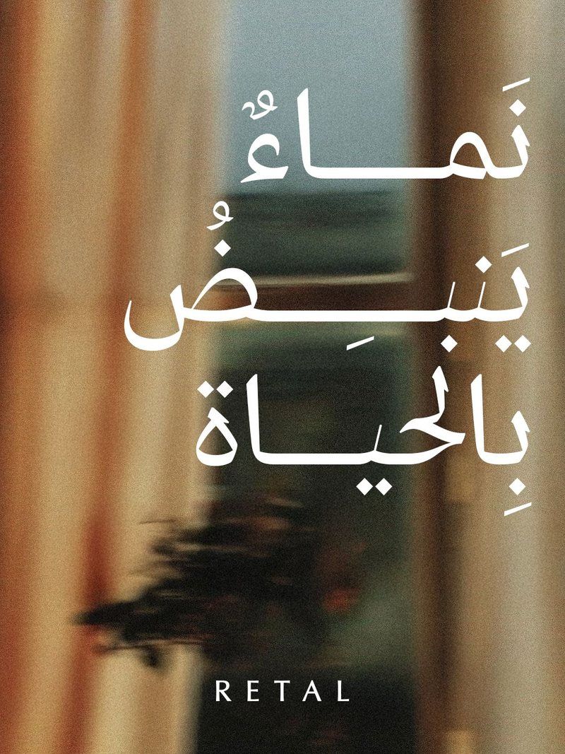
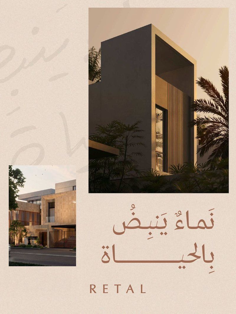
Where it landed
Two answers to one promise. One shows what lasts. The other shows what we remember. Both were presented to RETAL as part of Influence Group's social media and creative content proposal.
For me, the project proved something I believe about branding: a strategy only becomes real when someone can feel it in a single frame.