Client & agency
VOI, Saudi Arabia
with Singularity KSA
My role
Brand identity designer & art director
Scope
Logo, colour, typography, grid, iconography, mood boards, applications, campaign artwork
The brief
VOI is a Saudi innovations holding company. It picks projects by market demand, sustainability potential and regulation, and works with technology providers, construction suppliers and real estate service companies.
The brief was to present VOI as the exclusive community it offers, while keeping its image as a niche brand for a select audience. It had to read as a high-end holding company, one parent name that many ventures could sit under.
My role
What I did
Built the identity from zero
I started the identity from a blank page: the logotype, its shape language, the slash motif, the colour system and the typography.
Wrote the system down
I turned it into a 57-page guideline: clear space, co-branding, misuse rules, colour ratios, a 12-column grid, icons and photography styles.
Directed the team
I art directed the designers working with me: which images to choose, how layouts should look, and how the colours are distributed across every piece.
The idea
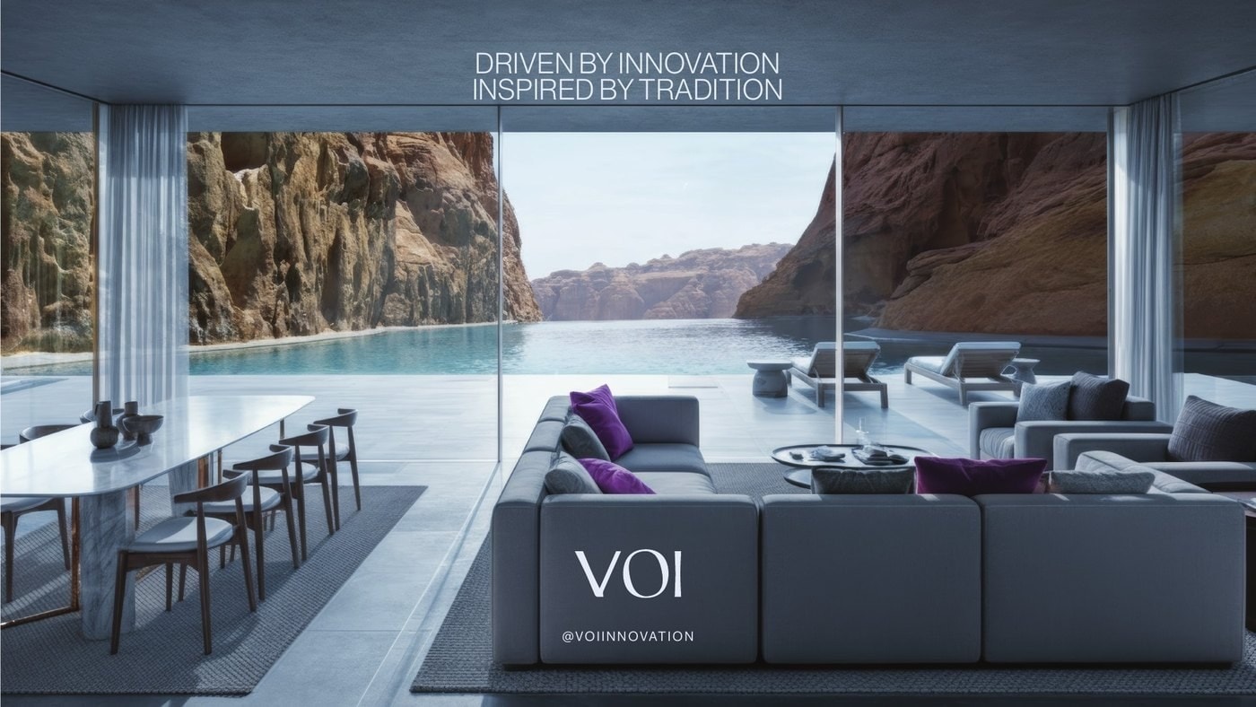
Driven by innovation. Inspired by tradition.
VOI lives between two things: solid foundations and adaptive growth. I wanted every part of the identity to hold that balance, sharp and soft, disciplined and flexible, exclusive and able to scale.
01
The logotype
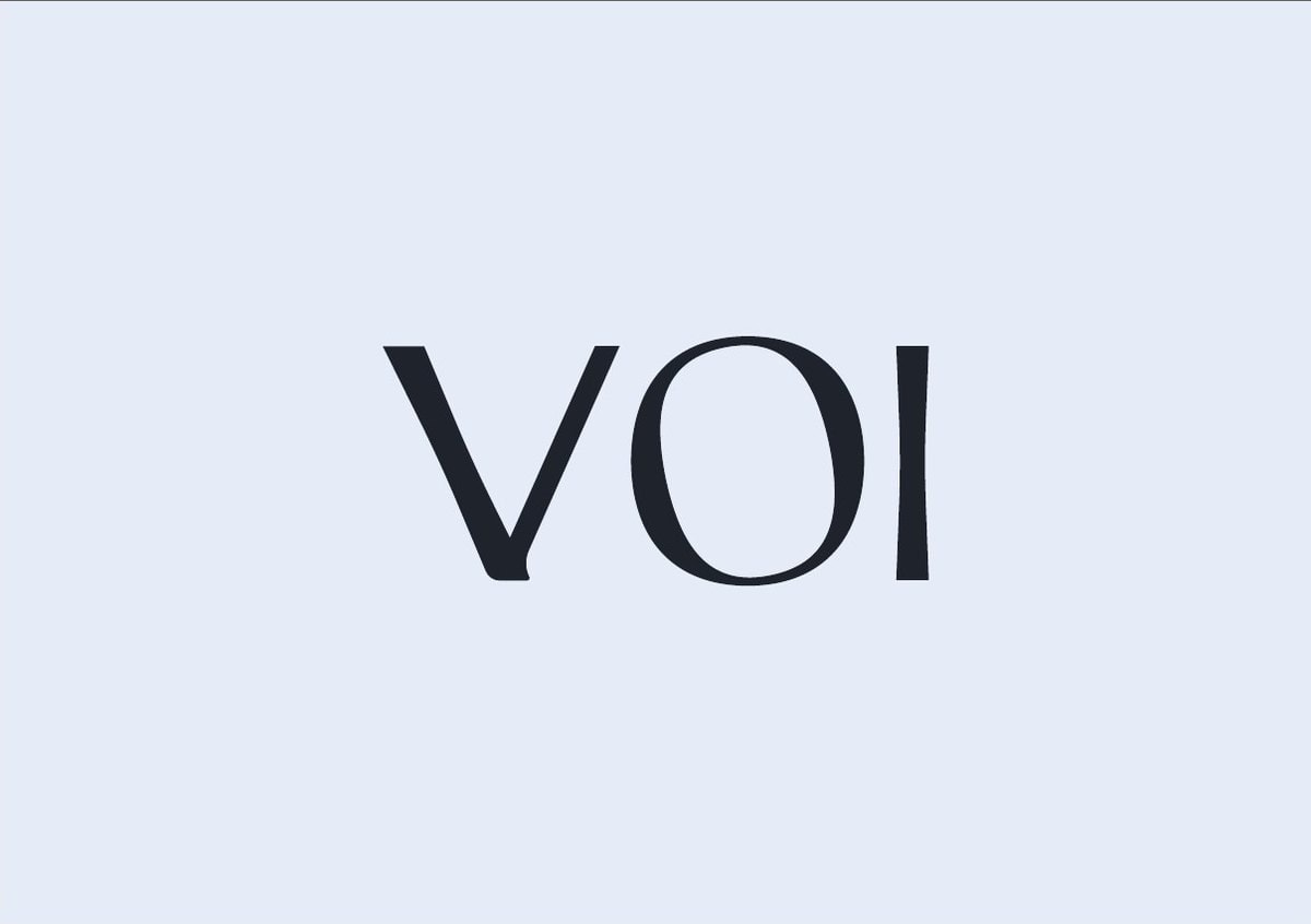
One word, two weights. Firm lines for stability, soft curves for the people behind it.
How I thought
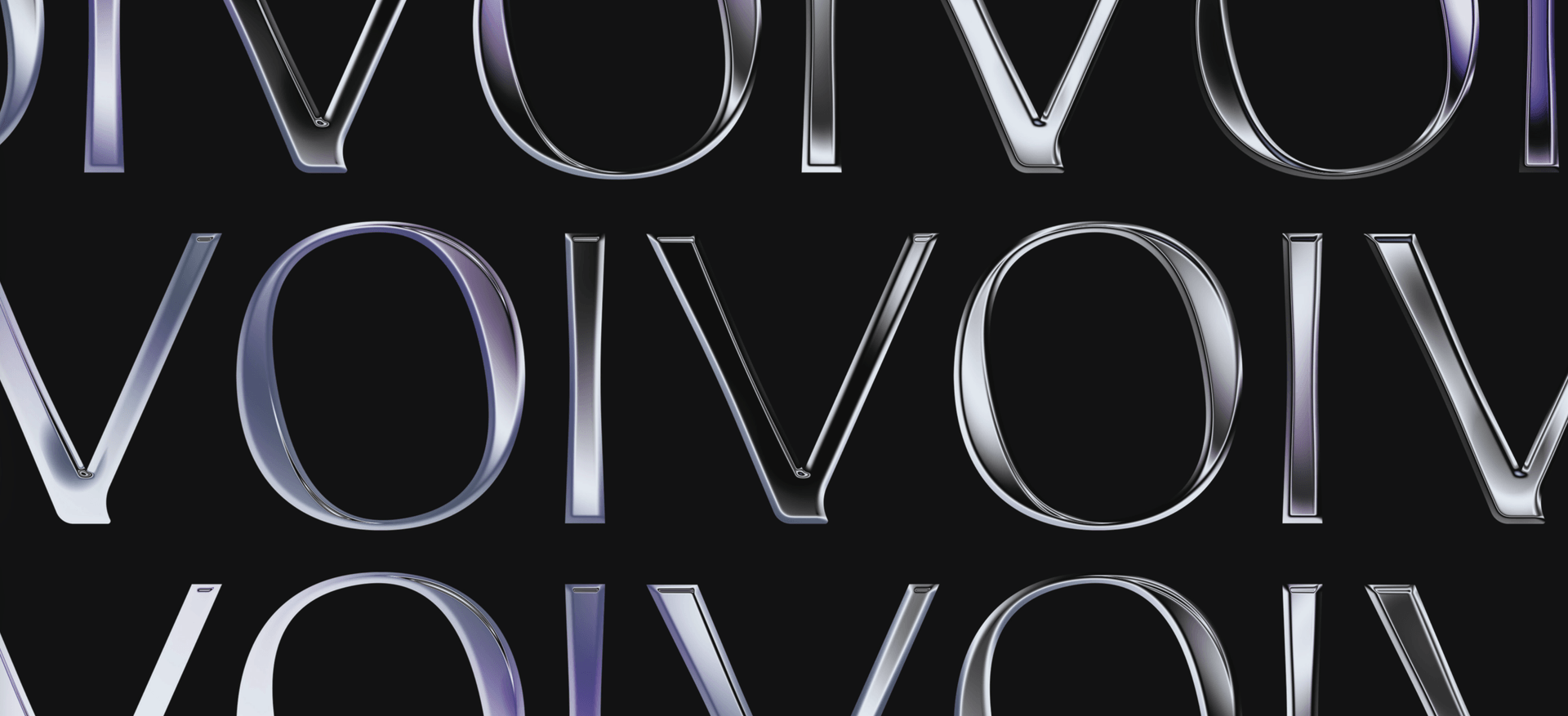
I kept the mark purely typographic, simple and elegant, so it could carry premium work without decoration. The letters use a double-weighted structure: thick and thin strokes side by side. That contrast is the brand's duality in one glance.
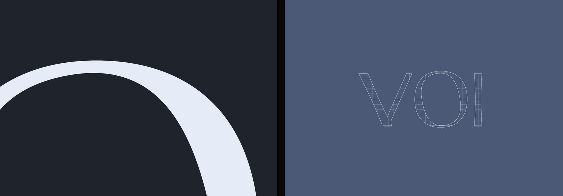
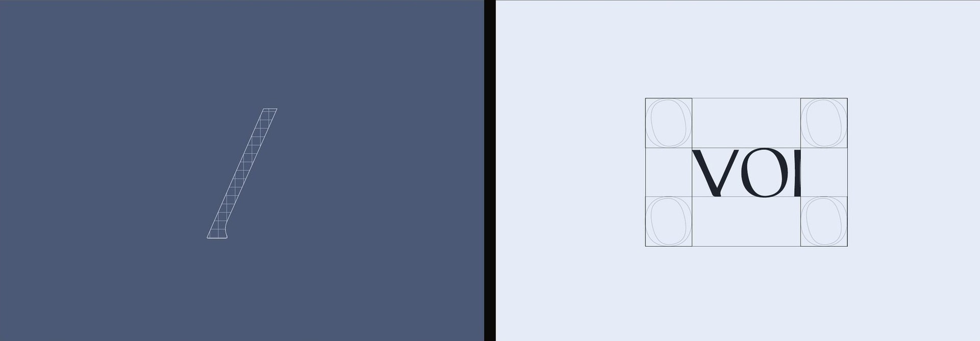
The curves come from the squircle, the shape between a square and a circle. It sits right between sharp and rounded, which is how I wanted VOI to feel: precise, but not cold.
Double weight
Solid foundations vs. adaptive growth. Discipline vs. creative flexibility.
Squircle curves
A human softness inside clean, confident lines.
The slash
Like a URL, VOI is the main domain that organises every venture beneath it.
Craft
Clear space and co-branding spacing are both measured from the O of the logotype, so the system scales from a business card to a billboard without new rules.
02
Colour
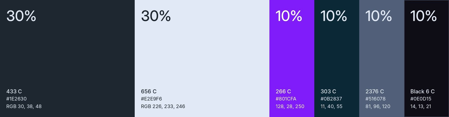
Deep blues for trust, soft neutrals for clarity, and one electric purple that only appears when it matters.
How I thought
Purple has a long history with prestige and elite positioning. I used it as the accent, never the base. The two primaries carry 30% each; the four supporting shades stay at 10% each. That ratio keeps the brand calm and lets the purple land with impact.

03
Type & system
Two languages, one voice.
How I thought
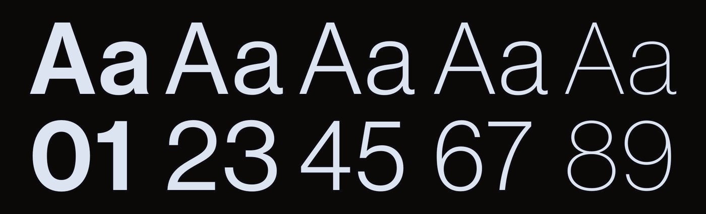
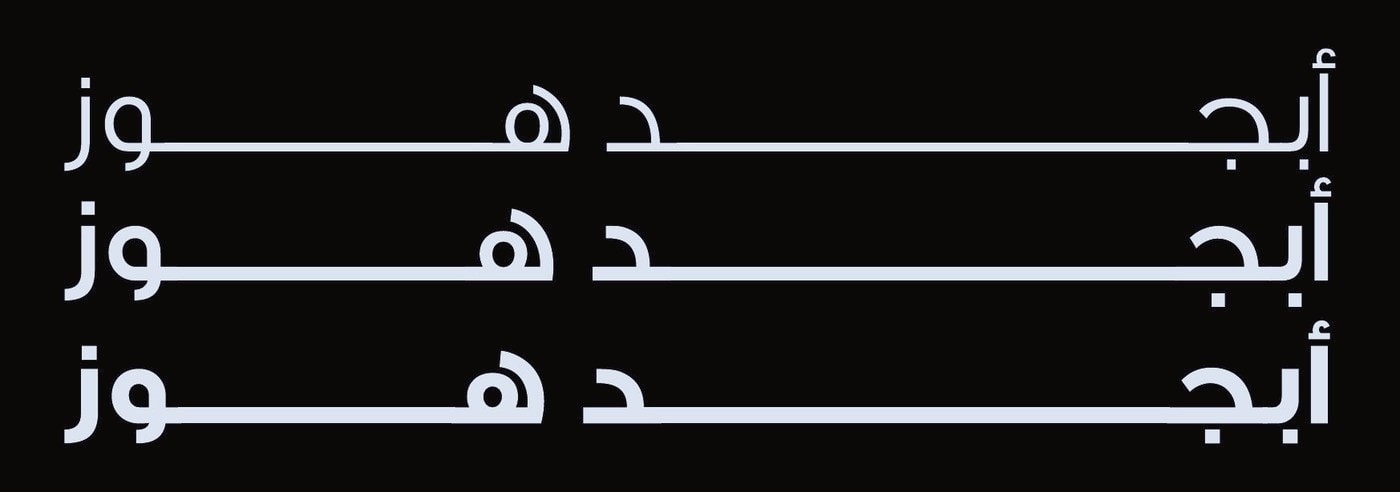
Haas Grot Display for English and GE SS Two for Arabic. Both are clean and modern, with balanced proportions, so a bilingual layout keeps the same tone on both sides. I also set fallbacks (Arial and Cairo) so the brand holds up on any system.
Underneath everything is a 12-column grid with double-width side margins, plus a minimal icon set for the brand's digital touchpoints.
04
Art direction
Large, quiet spaces. A single person in them. Light doing the talking.
How I thought
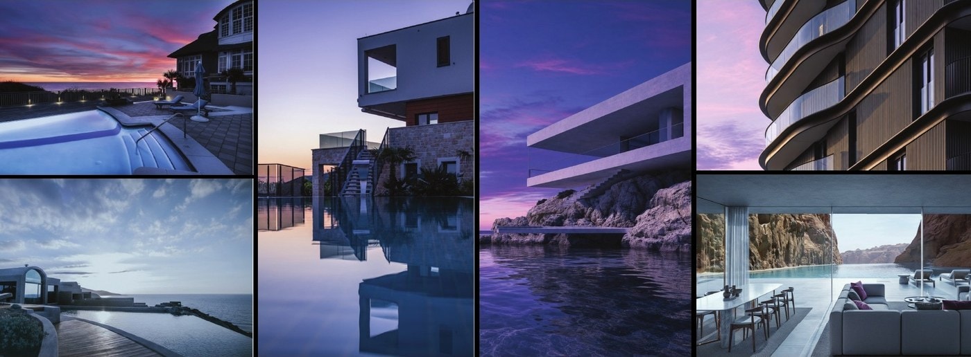
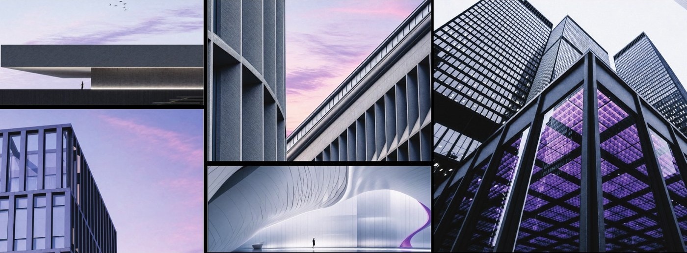
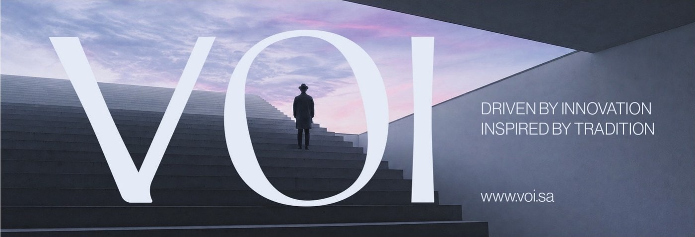
For a niche, select audience, the images had to feel aspirational without shouting. I set the direction for the team: minimal modern architecture, strong geometry, natural light and shadow, and human figures placed small inside big spaces to show scale and calm.
I built proposed mood boards for the client to shoot against and use on social media, across four styles: lifestyle, architectural, on-site and branded. I guided the designers on which images to pick and how the purple should appear in each.


05
Applications
Texture, emboss and one purple edge.
What I designed
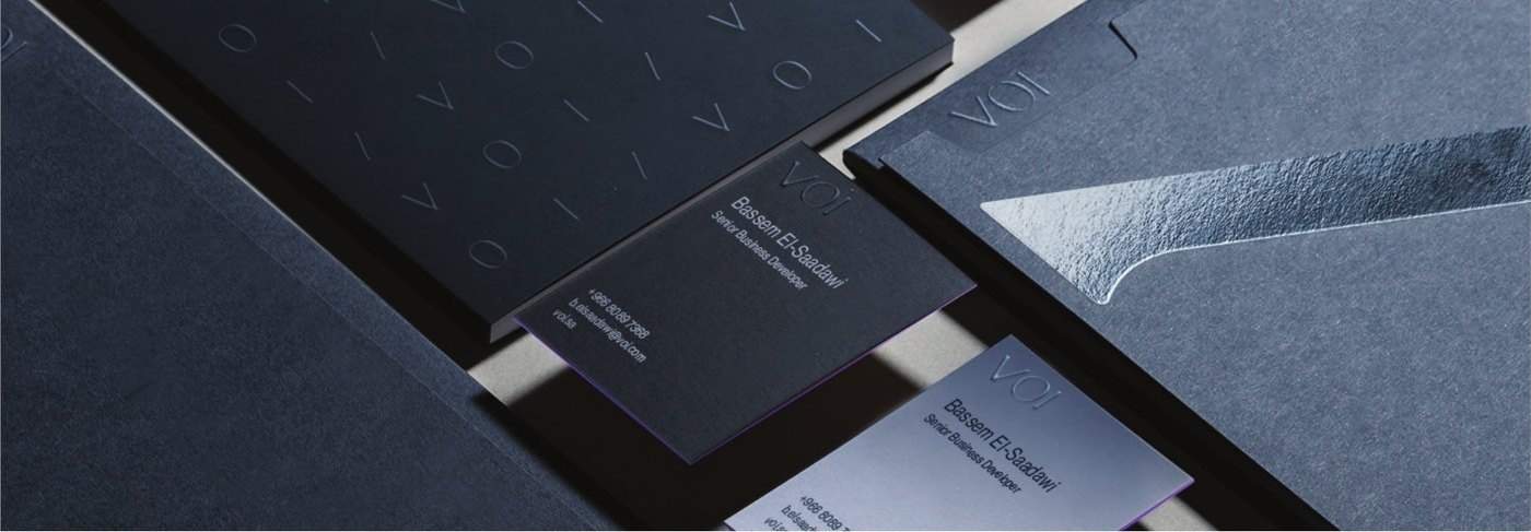
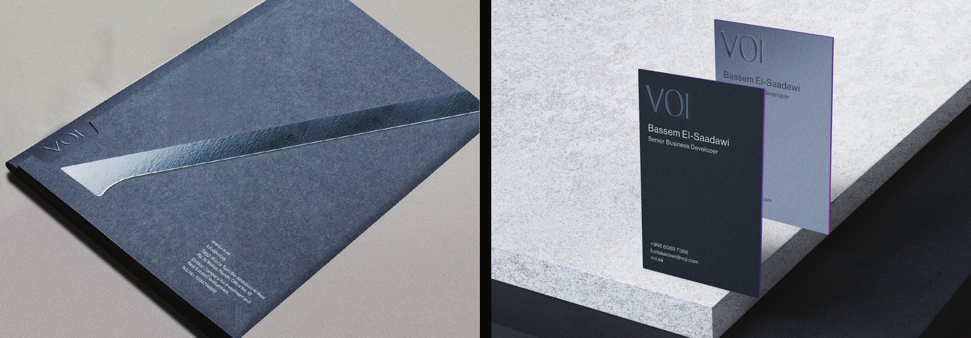
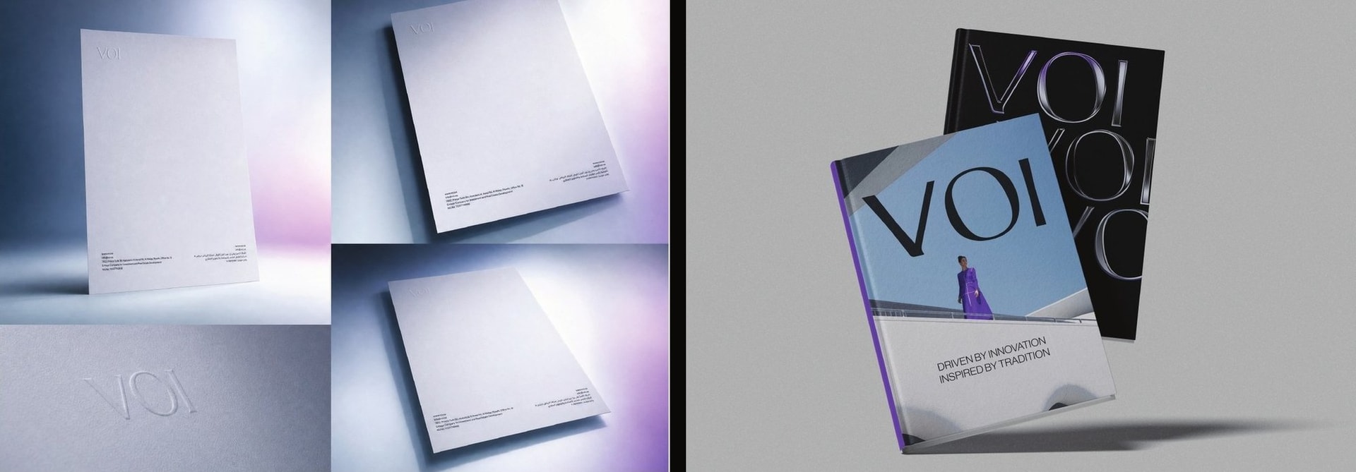
I designed the applications myself. The stationery leans on touch: textured stock, an embossed logo, metallic details on the folder, and a purple edge line on the business cards so the colour shows from every angle. The book covers show how far the identity can stretch, from architectural 3D type to minimal geometry to metallic violet light.
06
Campaign artwork
The name at monumental scale.
How I thought
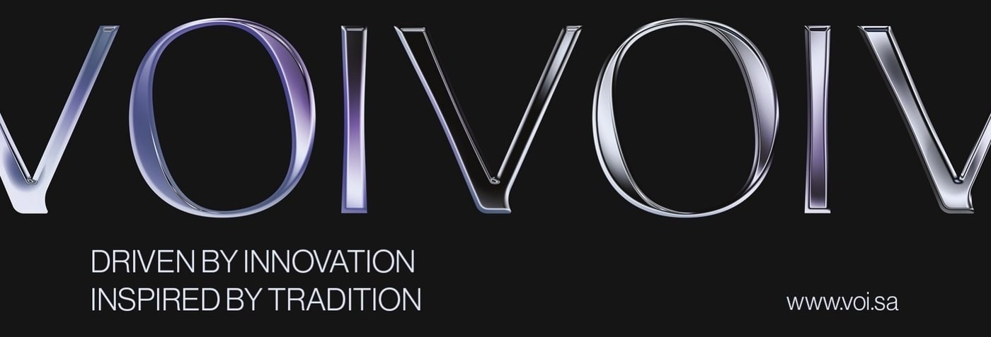
For billboards and posters, the logotype becomes the architecture. Huge letters, a dark or dusk palette, one figure, and the line "Driven by innovation, inspired by tradition." The brand is recognisable from a distance before you read a single word.

Outcome
A complete visual identity and a 57-page guideline that gives VOI one consistent voice across print, digital and outdoor. The system is strict where it needs to be and open enough for the team to keep creating new work under it.